Card
<ns-card> 
Overview
Cards can be used to contain content in a consistent and structured way.
Cards are used to apply a container around a related grouping of information; this can be done through imagery, illustrations and typography.
Examples
Guidance
Section
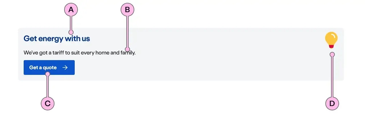
Key
| Key | Field type | Guidelines |
|---|---|---|
| A | Heading | The recommended length is between 4 and 12 words, not exceeding 50 characters in total. Headings contain light and bold font weight to highlight key messaging. |
| B | Content | A single, short paragraph works best. You are able to use inline text links within the paragraph if necessary. Don’t add additional headings within the paragraph and the copy length should not exceed more than two paragraphs of 3 lines each. Can contain bold copy <b>, inline links <a>, lists <ul> <ol>, and a caveat at the end of the relevant paragraph if required <a href="#caveat">1</a>. |
| C | CTA | Keep the text ‘short, relevant, and actionable’. It should not exceed more than 24 characters. |
| D | Illustration | Use to support and highlight the content. The illustration should relate to the product or service you are talking about. The specification table has a list of options. |
Support
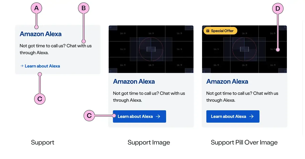
Key
| Key | Field type | Guidelines |
|---|---|---|
| A | Heading | The recommended length is between 4 and 12 words, not exceeding 50 characters in total. Headings contain light and bold font weight to highlight key messaging. |
| B | Content | A single, short paragraph works best. You are able to use inline text links within the paragraph if necessary. Don’t add additional headings within the paragraph and the copy length should not exceed more than two paragraphs of 3 lines each. Can contain bold copy <b>, inline links <a>, lists <ul> <ol>, and a caveat at the end of the relevant paragraph if required <a href="#caveat">1</a>. |
| C | CTA | Keep the text ‘short, relevant, and actionable’. It should not exceed more than 24 characters. |
| D | Image | This is the image that will be used above the ns-card. It should have an aspect ratio of 16:9, the dimensions should be 640x360px, the file type should be jpg, and the file size should be no more than 50kb. Don’t use imagery with white backgrounds. |
Flat
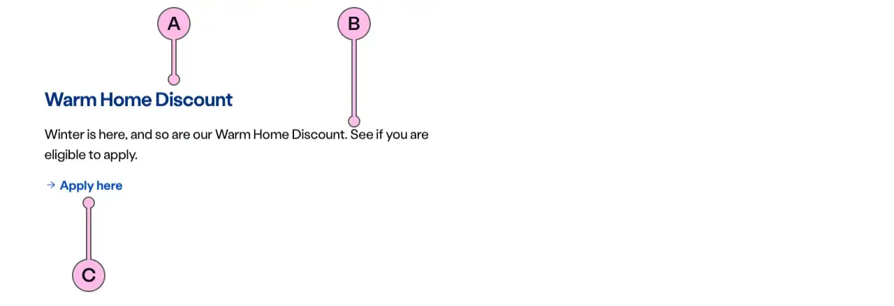
Key
| Key | Field type | Guidelines |
|---|---|---|
| A | Heading | The recommended length is between 4 and 12 words, not exceeding 50 characters in total. Headings contain light and bold font weight to highlight key messaging. |
| B | Content | A single, short paragraph works best. You are able to use inline text links within the paragraph if necessary. Don’t add additional headings within the paragraph and the copy length should not exceed more than two paragraphs of 3 lines each. Can contain bold copy <b>, inline links <a>, lists <ul> <ol>, and a caveat at the end of the relevant paragraph if required <a href="#caveat">1</a>. |
| C | CTA | Keep the text ‘short, relevant, and actionable’. It should not exceed more than 24 characters. |
Considerations
- Consider your CTA type and try to keep them consistent between rows across the cards, unless there is a need.
- There can be less than three cards in a row, but it should always use the triple layout. Always consider a lockup for this, before using the cards.
- Headings work best with one to four words.
- Please check the imagery guidelines when adding an image to the card.
- Be careful when using decoration in the panel with the section cards as the blue on blue with the CTA’s will make them not accessible.
- There should always be a heading to the group of cards inside the panel.
Implementation
Placement
The ns-card component can be used in the following components:
<ns-panel><ns-column><ns-footer><nsx-footer><ns-timeline-event>
Specification
Attributes
decoration
- Property
decoration- Description
- The name of the illustration to display on the card.
- Type
string
pill-over-image
- Property
isPillOverImage- Description
- Whether the pill should be over the image.
- Type
boolean- Default
false
image
- Property
image- Description
- The URL of the image to display on the card.
- Type
string
alt
- Property
alt- Description
- The alt text of the image.
- Type
string- Default
background
- Property
background- Type
boolean
type
- Property
type- Description
- The type of the card.
- Type
sectionsupportflat- Default
section
Slots
| Slot | Permitted tags | Description |
|---|---|---|
heading | <h2> <h3> | The heading of the card. |
paragraph | <p> | The paragraph of the card. |
cta | <ns-cta> <a> | The CTA for the card. |
action | <ns-cta> <a> <ns-form> | The CTA or form for the card. |
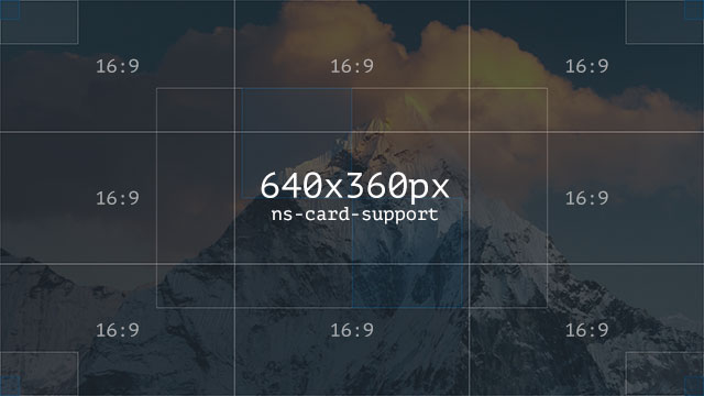
Image
| Component | Variant | Ratio | Dimensions | Size | Type | Placeholder |
|---|---|---|---|---|---|---|
ns-card | support | 16:9 | 640x360px | < 50kb | jpeg | ns-card-support-640x360px |
slot="action"
<ns-card type="support" decoration="bulb"> <h3 slot="heading">Get energy with us</h3> <p slot="paragraph">We've got a tariff to suit every home and family.</p> <div slot="action"> <!-- action content ns-cta/ns-form --> </div></ns-card><ns-pill>
To add a ns-pill to the card it needs to be placed inside one of the slots. Be careful about using it within the heading slot, as the pill content will be read out as part of the heading for screen readers.
If you have a group of cards, try to make sure that the pill is placed in the same location throughout those cards. This will make improve the readability of the cards.
Screen readers with ns-pill
<ns-card> <h3 slot="heading"> <ns-pill>Special Offer</ns-pill> Get energy with us </h3> ...</ns-card>In the above example the screen reader will read out “Special Offer Get energy with us”. Make sure that is what is expected. Remember the pill cannot be used on its own within a heading. Our advice is to rarely put pills in headings as they are normally conveying a message related to the heading, but is not heading content.
Pill over image
If using with a type of support with an image. There is also the option to place the pill over the image using the pillOverImage attribute. Note the ns-pill will need to be in the paragraph slot as it is no longer related to the heading.
<ns-card type="support" image="path/to/image" pillOverImage> <h3 slot="heading"> Get energy with us </h3> <p slot="paragraph"> <ns-pill>Special Offer</ns-pill> ... </p> ...</ns-card>More details on how to use the ns-pill can be found on the ns-pill documentation